Tuesday, 17 January 2012

Poster design 2


Shot of someone moving on in 'Being Human'
As I did not have access to Photoshop at home and did not know how to achieve the look for my poster I wanted, through the college computers I decided that designing my own poster completely would be a good option. I chose to create an image of the protagonist (Ivy) stood in a doorway that was glowing with light. I did this because of the connotations and links with passing and moving on to the other side. I also chose to use a lot of bright colours to mirror the style of lighting we used within our film whenever Ivy was having a 'nightmare'. I chose the silouhette shot as my basis because I felt it was a very iconic and recognisable within the film, I also felt that having the girl stood in the centre of the image, facing the light was a way to hint that she would face death. The idea of the door was actually took from the series 'Being Human' where when a character dies and is ready to move on, a door appears that shines a bright light through. They would then proceed to go through the door. I felt that by doing this it would also misleed the intended audience a bit, so that when they came to watch the film they wouldn't have everything already figured out.
After drawing out the concept for the poster, I painted it using water colours and then scanned it into my computer. Then in photoshop adjusted the hue and saturation as well as other small adjustments needed. I am quite pleased with the final design and because of the limitations I had, I think it turned out better than expected.

Poster Research & Inspiration

A poster can say a lot about its respective product; genre (and therefore potential audience), lead characters and possibly even plot. Smaller details such as the director, release date and tag lines are often included also. Much like film, posters have changed enormously since decades ago; before the 90's, illustrations were much more common than photographs; think the original iconic posters of Star Wars: A New Hope, they don't make them like they used to!

Much like its film counterpart, posters of today are riddled with special effects and CGI, all to attract a potential audience.


Considering the tone of our film and use of lighting, I'd expect the finished poster to be dark, and maybe even show the lead character as a silhouette with subtle lighting across her face; similar to the below examples.


The 'V for Vendetta' poster in particular is a good example of the kind of composition I'm aiming toward.

After a lengthy search of the internet I finally found the industry standard font used at the bottom of film posters detailing the distribution/production company, director, composer and many more. The font is called SteelTongs and after a quick download they were ready to use in word to incorporate into our future poster!

Monday, 12 December 2011

Genre Research #2


Genre could be described as a categorisation for film depending on its mood, tone and setting. Some of the most popular genres include drama, thriller, horror and comedy. One of the purposes of genre is to give audiences a better idea of the film they're considering watching; this is why genre has a massive impact on the audience of our short film. Particular people don't enjoy particular genres, and so it's a good idea to try and appeal to the 'mass audiences'.

As i've mentioned before, we wanted to avoid making a horror short, mainly because student horror films always tend to turn out a bit of a mess (and also neither of us admire the genre too much). However, some scenes from our short film seem to have fallen into the conventions of a horror film; suspense, dark tone and death included! Even so, we're managing to avoid falling into the trap of cheap horror, and the film still remains a dark drama with elements of horror; as i've also mentioned in a previous post - "drama has the potential to incorporate elements of many genres into one eventful film".

Drama also has the potential to be succesful even on a shoestring budget, compared to action/adventures which fashion huge hollywood sequences with big name actors. Becuase of the shoestring budget of some dramas, they also have the possibilty to be hugely profitable based on ROI (Return Of Investment). Regarding ROI, Dramas, Romance and Comedies have the second highest ROI right behind blockbuster action/adventure films.

Paranormal Activity, the film with
the highest ROI; 655,505.52%


The Audience

Keeping in mind the results of the audience questionnaire, we decided to grant the film a certificate 12 considering its mature themes. This certificate allows for a wide range of possible audiences, although I would still expect that the film wouldn't attract the attention of those under 15 simply because of its subject matter. I believe this is probably why the majority of candidates taking part in the questionnaire chose the 15 certificate as being the most suitable; a a 12A allows for children under the age of 12 to see the film if accompanied by a parent or guardian, but we wouldn't want that, so it seems most reasonable to opt for a certificate 12 - however, the certificate does not equate to what age group 'want' to see the film, but at what age viewing of the film becomes prohibited.

According to the BBFC, films granted with either a 12A or 12 certificate must handle mature themes in a manor that is appropriate to that of a young teenager.

Much like the certificate of the film, the genre also changes the potential audience of the film. I would say that a drama, for the most part, is a character driven story focusing on a series of events; they can be gripping, exciting and even emotional. This then, allows for a wide range of audiences to be interested in the film, thus creating a much larger audience range. If you think about, there is probably a sense of 'drama' in most films ever made - you can see from film websites such as IMDB and Rotten Tomatoes, a film may be classed as a thriller, kids movie or even mystery/suspense, but they all may be labelled 'drama' too. This is why the drama genre bodes well for the short film; many may not be interested in horror movies, sci-fi or romcoms, but drama has the potential to incorporate elements of many genres into one eventful film.

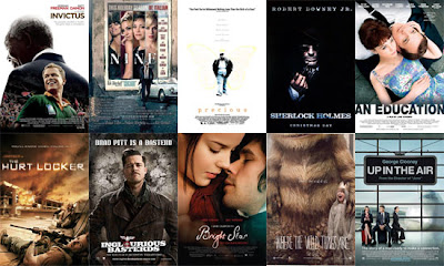
 A short list of films, illustrating how varied a 'drama' can be; there are kids
dramas, sci-fi dramas, fantasy dramas, mystery dramas, etc, etc.

We would expect our short film to be watched mainly on YouTube. Other places it will available to watch are on Facebook and our blog. Each website allows for a different type of audience; Facebook and YouTube are more likely to attract the average viewer - considering the sheer number of uploads on YouTube, it's highly unlikely that friends and family will find our short film without guidance, so we will be pointing friends/family toward our film upon its completion.

YouTube - home to thousands of short films.
YouTube has always been great for aspiring video and filmmakers, with some short films gaining upwards of 10 million views. Judging by the views on YouTube, audiences tend to lean toward drama and action, with very little successful horrors. I think dramas prove so popular on YouTube because they can tell short, sweet stories in a small space of time.

Monday, 5 December 2011

Reborn, Production Logo

Adie had the idea to use flames in conjunction with the word 'Reborn' for our company logo, as though to portray the phrase 'rise from the ashes'.
There's a large quantity of free stock footage across YouTube of flames, although some aren't quite what we were looking for. We may probably even film our own flames, that way we can get the exact look we're hoping for.

I went ahead an experimented with stock footage I found from youtube -


With this original footage at hand, I wanted to speed up part of the sequence so that slow motion wasn't used through the entirety of the clip.
We also had in mind the idea of adjusting the flame in a way that it looked hand drawn; an effect we'd seen in a previous A2 students logo. With regards to the title 'Reborn', we simply wanted it to appear alongside, or behind the flames.
(The below video is just a first draft of the production logo, incorporating a handful of our ideas)


Final production logo; added bloom effect to the black underlaying writing.


Title Sequences

The title sequence of a film can be very important; it can even in some cases give us a subtle insight to the nature or themes of the film. So how exactly do filmmakers avoid boring the audience with cast and crew names fading around the screen?

On Her Majesty's Secret Service's Title Sequence
The Man With The Goldren Gun's Title Sequence
Goldfinger's Title Sequence
A particular website, 'Art of the Title' dedicates itself to "the artists who design excellent title sequences".
Some examples include 300, Lemony Snicket's A Series of Unfortunate Events and Casino Royale.
Keeping in mind James Bond films, the franchise has almost always used their title sequences in a way that depicts the topic of the film, 'Goldfinger' for instance shows women painted in gold as well as scenes from the film with a gold overlaying colour. A couple of the earlier Bond films also chose to reminisce on previous of the series' entries, as though to recap other of Bond's adventures. Whereas some simply chose to show silhouette's of women; an iconic image associated with Bond.

The artists behind these title sequences make them bearable with stylish imagery and dazzling colours. Perhaps most importantly is the theme song for the film; with the title sequences acting almost as an unveiling to the new Bond theme.

Many other title sequences from various films follow these traditions and incorporate their artistic style into the titles, affecting the fonts, music and imagery. A prime example being 'Juno'.

Just a handful of 900 still images composed to make Juno's title sequence.

Juno's title sequence went through a lot of work, including 900 still images of Ellen Page walking on a treadmill and drinking SunnyD. These images were then run through a Photocopier to degrade their quality and achieve the hand drawn look that the final sequence offers. Finally, they were physically cut out and scanned back into a computer on top of digitally drawn backgrounds to achieve this colourful, quirky stop-motion title sequence. Shadowplay, the studio behind the title sequence have had the pleasure of working on other Jason Reitman films including 'Thank you for Smoking' and 'Up in The Air'. The studio are good at what they do because they don't just write the names of the cast and crew across their titles, they treat the sequence as a separate project of its own, and therefore provide the audience with often colourful, unique approaches to title sequences.

Of course, with a time restriction of 5 minutes, we cannot afford to have a long title sequence, and so will effectively 'cram' our titles during the introduction of the film, after Ivy has woke up for the first time from her nightmare. Like most short films, we won't put too much emphasis on the title sequence except for the title itself.

Title Sequence Analysis

I have chosen to analyse 'The Sixth Sense' because of the similarities it shares with our short film (plot and character commonalities rather than title sequence).
The lead character in both 'The Sixth Sense' and our short film are children, suffering with issues revolving around the dead; Ivy, our lead character, is tormented by someone, something, in her nightmares. The nightmares are recurring and affect her day to day life. Cole, the lead character of 'The Sixth Sense' is able to see and speak with the dead leaving him troubled and isolated. - both film has a similar structure, in the sense that the endings have revealing twists which help us further understand the plot.

There is in fact very little to say about TSS's (The Sixth Sense) title sequence; it doesn't use any of the discussed methods to keep the audiences interest, consisting of only bland text and James Newton Howard's accompanying orchestral score.

In fact, the only factor of the title sequence that portrays the subject of the film is the score itself. Its violins reach crescendos when the films title appears through the sequence, and the composition is constantly haunting and slow.

Each frame of text utilizes both tracking and size to try and make for a more interesting title sequence, but the affect quickly wears thin. Below is my own attempt to recreate this 'growing text' effect.


I key-framed both size and tracking to create the 'expanding' effect,
I also changed the font colour to that of The Sixth Sense's.


The only interesting aspect of the title sequence is the reveal of the title itself, which as said, builds to a crescendo, but also appears to be coated in moving shadows referring to theme of the film.

The title sequence lasts for around two and a half minutes; as the music begins to fade and the final title screen begins to dim, the shot very slowly fades in to a lightbulb - the start of the film.

Although these are the style of titles we wish to use (simply because we don't have the time or skill to do otherwise), we will use them alongside the film, rather than seperately. This way the audience don't feel they're watching 2 minutes of text!