Showing posts with label Benjamin Squires. Show all posts
Showing posts with label Benjamin Squires. Show all posts
Monday, 16 April 2012
Friday, 30 March 2012
Critical Evaluation - Benjamin Squires
1. In what ways does the media product use, develop or challenge forms and conventions of real media products?
Research into continuity and the language of film and editing was a major part of the preparation that I did before we began filming. I personally revised rules of film such as the 180 and 30 degree rules, the video below is a perfect explanation of the 180 degree rule.
I also took an extensive look into colour editing and the look of film compared to digital video. I did this because I personally wasn't happy with the look of my AS film; I felt that the video looked very 'digital'. I have always thought that the giveaway of a student film is in the poor video quality, I often overlooked many short films on YouTube whilst researching continuity and story telling in short films because of poor video and production quality.

I also took into consideration the pace of the film we were going to make - we had always planned on making a drama which would normally consist of drawn out shots and a slow pace. Unfortunately due to time constraints and inexperience of building an effective atmosphere, we avoided a slower a pace, keeping the editing and cutting consistent and always moving the narrative forward swiftly.
We had always intended to conform to the conventions of drama, moving the narrative forward with thoughtful conversations between the characters and both visual and audio cues throughout the film (tire screeching sound effect, roses on the lamppost, hand resting on the chair). The characters always had to be authentic too whilst telling a believable and even relatable story, giving the audience as much as an emotional attatchement to the characters as we could. I always would've wanted the ending of the film to be a happy and satisfying one for the audience, leaving them with positive emotions and connotations regarding the film. However, I knew this would only work if the story had started on such a low point; Ivy is consistently unhappy throughout the film and we used the 'gloomy' nature of the film to reach a more satisfying, conclusive finale - this way the audience are glad to see that the character's story ends on a positive note.
 To create a deep illusion of film for the audience, we threw in a lot of other classic film/genre elements. The first scene is typical of that of a horror/thriller; we see a petrified, defenceless girl, the music builds slowly to a loud crescendo and the protagonist is about to meet her end before she shoots out of bed and the music stops to a halt. She was having a nightmare. When the same girl notices the 'monster' across from her one night, she drops a cup of water and it crashes to the floor (we would've done this in slow-motion if we had cameras capable of recording in higher frames per second).
Our film conforms to a number of Richard Dyer's sensibilities from his theory of entertainment and utopia. These include intensity and energy. For example, If the viewer has been paying attention to Ivy's story then the build up to the confrontation scene in Ivy's final nightmare should provide the audience with intensity. The film supplies 'energy' during the second nightmare when Ivy has to franticly run away from 'the monster'. This particular sequence consists of snappy cuts and a huge orchestra crescendo. Whether the films manages to make these impressions on the audience is up to them!
Ivy's character could be compared to Cole Sear, the lead character in 'The Sixth Sense' who is suffering because he is able to see/communicate people who have already died. Ivy's character is also plagued by this same issue in a sense, except she only sees her sister and only in her nightmares.
Research into continuity and the language of film and editing was a major part of the preparation that I did before we began filming. I personally revised rules of film such as the 180 and 30 degree rules, the video below is a perfect explanation of the 180 degree rule.
I also took an extensive look into colour editing and the look of film compared to digital video. I did this because I personally wasn't happy with the look of my AS film; I felt that the video looked very 'digital'. I have always thought that the giveaway of a student film is in the poor video quality, I often overlooked many short films on YouTube whilst researching continuity and story telling in short films because of poor video and production quality.

I also took into consideration the pace of the film we were going to make - we had always planned on making a drama which would normally consist of drawn out shots and a slow pace. Unfortunately due to time constraints and inexperience of building an effective atmosphere, we avoided a slower a pace, keeping the editing and cutting consistent and always moving the narrative forward swiftly.
We had always intended to conform to the conventions of drama, moving the narrative forward with thoughtful conversations between the characters and both visual and audio cues throughout the film (tire screeching sound effect, roses on the lamppost, hand resting on the chair). The characters always had to be authentic too whilst telling a believable and even relatable story, giving the audience as much as an emotional attatchement to the characters as we could. I always would've wanted the ending of the film to be a happy and satisfying one for the audience, leaving them with positive emotions and connotations regarding the film. However, I knew this would only work if the story had started on such a low point; Ivy is consistently unhappy throughout the film and we used the 'gloomy' nature of the film to reach a more satisfying, conclusive finale - this way the audience are glad to see that the character's story ends on a positive note.

Our film conforms to a number of Richard Dyer's sensibilities from his theory of entertainment and utopia. These include intensity and energy. For example, If the viewer has been paying attention to Ivy's story then the build up to the confrontation scene in Ivy's final nightmare should provide the audience with intensity. The film supplies 'energy' during the second nightmare when Ivy has to franticly run away from 'the monster'. This particular sequence consists of snappy cuts and a huge orchestra crescendo. Whether the films manages to make these impressions on the audience is up to them!
Ivy's character could be compared to Cole Sear, the lead character in 'The Sixth Sense' who is suffering because he is able to see/communicate people who have already died. Ivy's character is also plagued by this same issue in a sense, except she only sees her sister and only in her nightmares.
 |
| Cole Sears, lead character in 'The Sixth Sense' |
 |
| Ivy, lead character in 'Nightmares' Other aspects may also be comparable such as the title sequence which I looked particularly close at. Each of the films use a very simple font against a plain black background to introduce the films, the music also 'swells' in a way when the title of the film is revealed, similar to how the main theme beings to play in 'Nightmares'. |
2. How effective is the combination of your main product and the ancillary texts?
3. What have you learned from your audience feedback?
4. How did you use new media techniques in the construction and research, planning and evaluation stages?
From the very beginning of our project, I remember new media technologies being particularly important to us as a team. Through the popular social networking site, Facebook, we were able to regularly discuss initial ideas and thoughts about the film that we hoped to create. I personally also used Skype to send a couple of my friends a first draft cut of the film to make suggestions to improve the quality before the final cut was made. But arguably the two most important websites that we used for the duration of the course were www.blogspot.com and www.youtube.com.


Just as we did in our previous year, we set up a blog displaying all of our work as a team and as individuals; this also helped us keep track of what tasks we had to complete and how far along we were in the process of film-making. Right from the beginning of the course I was using YouTube to research a large quantity of short films; the variety of which across YouTube is astonishing. Many of the films gave me great inspiration, both from amateur and professional filmmakers alike. Another fairly important website I used was www.imdb.com, the internet movie database, giving us access to trivia of films, budget, cast and crew, etc. Arguably, the Internet has been my biggest source of inspiration for the duration of the course.


As soon as filming was complete, we moved back into the classroom to commence editing on the colleges iMacs. The iMacs have Final Cut Express installed on them, video editing software that I had now personally become comfortable using thanks to previous experience and owning the software at home. This meant I was very confident whilst approaching the editing stage after demonstrating ways in which we could achieve a more professional film look in Final Cut on the blog beforehand.
The ease of Final Cut allowed me to create effects in the film that I would've otherwise never known how to do. At one point for example, Ivy wakes from her nightmare and the screen fades to white before dissolving back into a shot of her in the bedroom. Timing was essential in this scene to create the right amount of tension. I made a solid white still in Final Cut and had the shot dissolving into the colour then into another shot to create the effect.
There are a couple of things that I think could still be improved upon in regards to the editing stage; I couldn't quite control the unfortunate noise that was produced from the attached microphone during filming. It left almost every single shot with an annoying hissing sound which I managed to remove the most of using a very precise equaliser and hum remover.
My knowledge in Music Technology helped me more than ever here! A lot of the shots had to be colour corrected in some way or another, sometimes to achieve colour continuity throughout the film to maintain the mature tone, others to simply brighten them up because of the purposefully unlit sets.
I also used Livetype again this year to create a font effect that we would use to show the title during the film. I did in fact use the same effect as I did for my AS film; simple but very effective, and relevant to the film!
Another important piece of software at my disposal was Logic Pro 9, audio editing and MIDI sequencing software that allowed me to compose the score for my short film, as well as create the final radio trailer for our film.
3. What have you learned from your audience feedback?
4. How did you use new media techniques in the construction and research, planning and evaluation stages?
From the very beginning of our project, I remember new media technologies being particularly important to us as a team. Through the popular social networking site, Facebook, we were able to regularly discuss initial ideas and thoughts about the film that we hoped to create. I personally also used Skype to send a couple of my friends a first draft cut of the film to make suggestions to improve the quality before the final cut was made. But arguably the two most important websites that we used for the duration of the course were www.blogspot.com and www.youtube.com.


Just as we did in our previous year, we set up a blog displaying all of our work as a team and as individuals; this also helped us keep track of what tasks we had to complete and how far along we were in the process of film-making. Right from the beginning of the course I was using YouTube to research a large quantity of short films; the variety of which across YouTube is astonishing. Many of the films gave me great inspiration, both from amateur and professional filmmakers alike. Another fairly important website I used was www.imdb.com, the internet movie database, giving us access to trivia of films, budget, cast and crew, etc. Arguably, the Internet has been my biggest source of inspiration for the duration of the course.


When it came to filming and editing, there were a large number of new media technologies that helped us achieve our final product. We used the Sony HDV-1000 video camera. A camera that allowed us to shoot in 1080i, HD quality footage, this alone made the film look a whole lot more professional. The microphone that we used to record the sound was not the one equipped with the HDV-1000, but a better quality boom microphone. Along with such technology, we also had access to some impressive lighting equipment, both from college and from my teammates dad who works in archaeology (lighting that was in fact so bright that we couldn't use during certain scenes because it lit too much!). I also, for the first time, used a Steadicam for improved stability whilst controlling the HDV-1000 during moving shots such as tracking or dollying. Although I enjoyed using the Steadicam, I wasn't amazing with it and many of my attempts using it didn't look fantastic and were subsequently cut from the film. Nevertheless, It was worth it for the experience of using it and one shot in particular that made it in to the film I am quite proud of!


As soon as filming was complete, we moved back into the classroom to commence editing on the colleges iMacs. The iMacs have Final Cut Express installed on them, video editing software that I had now personally become comfortable using thanks to previous experience and owning the software at home. This meant I was very confident whilst approaching the editing stage after demonstrating ways in which we could achieve a more professional film look in Final Cut on the blog beforehand.
The ease of Final Cut allowed me to create effects in the film that I would've otherwise never known how to do. At one point for example, Ivy wakes from her nightmare and the screen fades to white before dissolving back into a shot of her in the bedroom. Timing was essential in this scene to create the right amount of tension. I made a solid white still in Final Cut and had the shot dissolving into the colour then into another shot to create the effect.
 |
| The fade to white edit. |
There are a couple of things that I think could still be improved upon in regards to the editing stage; I couldn't quite control the unfortunate noise that was produced from the attached microphone during filming. It left almost every single shot with an annoying hissing sound which I managed to remove the most of using a very precise equaliser and hum remover.
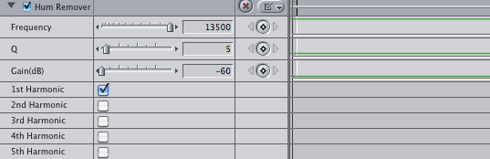 |
| The details of the hum remover, any more harmonics used created an effect that was far too obvious. |
 |
| The colour corrector during a scene which was simply too dark; half of the shot is adjusted with a colour corrector which then fades to the regular colours of the shot. |
Another important piece of software at my disposal was Logic Pro 9, audio editing and MIDI sequencing software that allowed me to compose the score for my short film, as well as create the final radio trailer for our film.
 |
| Scoring in Logic Pro with realtime video playback. |
Within Logic I had access to several instrument libraries allowing me to replicate an orchestra from my bedroom at home! These particular sample libraries that I used were from a company called EastWest. They founders of the company specialise in writing 'epic' orchestral scores for hollywood film trailers, as well as creating incredibly detailed instrument libraries. I personally own EWQL Silk, Symphonic Orchestra, Gypsy and SD2. Most of the instruments that were available to me simply weren't applicable to the genre of 'Nightmares'. Therefore, I used a lot of simple instruments such as the piano, violins and other string instruments, and a few synthesisers. Reverb was one of the key parts to the score of the film, it adds a sense of 'dreaminess' to the soundtrack with haunting piano hits and crescendo violin effects. I am also able to control the articulations (style of playing) of the orchestra as well as it's volume, giving me huge control over the sound of my music.
This was the third time I have scored a short film, and i'm getting in to the hang of it! With each piece of music I compose I get better.
Finally, I also used Adobe Photoshop and a Wacom graphics tablet to paint and manipulate photos from filming to create a poster for our film. I took a shot from the film which I particularly liked, a silhouette of Ivy. I also got a character profile of Ivy's dad. Incorporating each of the stills into the poster and painting part of it myself, I was able to create a very professional looking poster. I also found the official 'movie poster' font after a short time spent searching the internet. I would've been lost without the internet during A2 media!
 |
| A selection of virtual instruments available to me. |
 |
| A number of available articulations for 18 violins. |
This was the third time I have scored a short film, and i'm getting in to the hang of it! With each piece of music I compose I get better.
Finally, I also used Adobe Photoshop and a Wacom graphics tablet to paint and manipulate photos from filming to create a poster for our film. I took a shot from the film which I particularly liked, a silhouette of Ivy. I also got a character profile of Ivy's dad. Incorporating each of the stills into the poster and painting part of it myself, I was able to create a very professional looking poster. I also found the official 'movie poster' font after a short time spent searching the internet. I would've been lost without the internet during A2 media!
 |
| Stills from the film and a suitable title font. |
 |
| The painted version of Ivy |
 |
| The original photo of Ivy (with some already added painting) |
Thursday, 15 March 2012
Nightmares, Radio Spot (Trailer)
Just as I found researching radio trailers difficult, creating one was also surprisingly hard; I had to put a lot more thought into the choice of dialogue, sound and music than i'd originally expected.
I'm really pleased with the radio spot i've made, I think it hits the right tone and reflects the story and mood of 'Nightmares' just right. I also made the choice to lead the audience in the wrong direction however.
The radio trailer makes out that this could be a positively themed film, with the father asking "How'd you sleep?", and the daughter replying "Yeah, slept fine". The tone shifts completely however when the father comments: "Ivy, are you still having nightmares?"
I wrote accompanying music specifically for the radio spot, featuring 'Ivy's Theme' in a more orchestrated performance. The key of the piece then changes to minor once Ivy's dad makes the comment, and the stereotypical violin crescendo's play.
 |
| Logic Pro, my audio/MIDI sequencer! |
 |
| The yellow lines indicate volume control, manipulated to accompany the music. |
I quietened the music when Ivy and Nick are speaking, and boosted the volume when it was most important; the crescendo and revelation of nightmares.
I decided only to do a little narration for the trailer, stating the title of the film, release date and age certificate. I also recorded the narration in a somber, deep tone, this way the audience aren't too distracted by the narration and I manage to maintain the tense atmosphere of the trailer.
Wednesday, 14 March 2012
Radio Trailer Research
Radio trailers for films these days are hard to come by; as technology becomes evermore popular, advertising flocks to the internet and spreads across the entire web in a bid to garner a huge audience and create unstoppable word of mouth. Go back a few decades however to 1975 and you might have heard the radio spots for 'Death Race 2000'. Go back even further and you might have heard radio spots for James Bond's 'Thunderball' (both seen below). As you can tell, the method of advertising has changed greatly and even the way they describe the film would now be considered massively outdated and cheesy.
The third trailer down promoting the film 'Alien' is a lot more appropriate; it creates tension with little dialogue and a suspenseful string section mixed with odd sound effects. There is very little narration, just the tagline of the film - "In space, no one can hear you scream", the distributor, certificate and title. All said in under 10 seconds.
I will use this kind of approach when editing together our films radio spot to create a tense atmosphere with minimal narration.
Tuesday, 13 March 2012
First Draft, Five Minute Film - Nightmares
This is the first draft of our five minute, short film - Nightmares.
This version of the film tells the complete story, but there are some major changes we need to make in terms of editing. We need to work on smoothing out the transitions between each sequence (day), and feedback from the viewers offer other suggested changed also:


We'll keep the comments in mind, particularly those regarding the use of a colour corrector and making the transition between the days smoother and more clear.
We have received a lot of positive feedback regarding the film however, from other members of the class and other Media classes alike, a lot of praise about the film has also come from tutors at the college.
Tuesday, 24 January 2012
Composing for Film
Over the past years i've become an avid composer in both my spare time and work; Doing so has given me confidence to write my own music for both my AS and A2 Media films.
Having such software as Logic Pro and a number of instrument libraries from EastWest (http://www.soundsonline.com/) means I can dive straight into composing at home between the gaps of editing the film.
With Logic, I can open part of the film to play alongside my composition, giving me greater accuracy with the timing of the film in coordination with the score.
Below is a short video of my setup at home for composing music, along with a draft composition for 'the breakfast scene'.
Having such software as Logic Pro and a number of instrument libraries from EastWest (http://www.soundsonline.com/) means I can dive straight into composing at home between the gaps of editing the film.
With Logic, I can open part of the film to play alongside my composition, giving me greater accuracy with the timing of the film in coordination with the score.
 |
| The Breakfast Scene, scored using EWQL Symphonic Orchestra in Logic |
Monday, 23 January 2012
Getting more used to the steadicam!
The first time I used the steadicam I found it pretty difficult; even more so on our first day of filming considering I was battling some pretty gusty winds! Here's a compilation of some of the first steadicam shots of filming day one -
Most of the steadicam shots from day one are pretty much unsalvageable, we did get some better results from filming day 2 though, but in the end I think we'll opt to use the alternative tripod shots of the sequence, as featured in the end of the following video -
In regards to the progression of the film, we only have one day left of shooting which will take place this wednesday. If all goes to plan, filming should be complete and editing can go into full swing! After having a quick glance through all of our footage, it doesn't look likely that we'll be needing to do any reshoots.
Tuesday, 17 January 2012
Poster Design
Considering that all the filming is complete and editing is well underway, I started designing a poster for the film based on my inspirations and research from an earlier post. I hadn't used Photoshop in a while but jumped straight in with my graphics tablet and got to work. For me, the film seems like one of its key aspects is the use of light and how it portrays Ivy's emotions and so really wanted to capture and incorporate that feeling into the poster, which meant using colourfully manipulated images alongside the silhouette of Ivy I had in mind.

I'm really pleased with how this turned out, I envisaged just Ivy in the poster with light beaming behind her, but as I continued making the poster I realised how empty it might turn out; below is an example of the above poster without the additional images.

In some ways, it's more effective than the above poster because of the 'dreamy' light beaming from the right, but I think the use of colour really gives the other poster the edge.
I will probably get feedback from other members of my class regarding which poster is more suitable!
The posters were created using Adobe Photoshop and a Wacom Intuos 3 Graphics Tablet. The silhouette of Ivy is a combination of both a digitally painted and real image. The 'dreamy' beaming colour was digitally painted (whilst using a lot of 'smudge'!) to intensify the emotions of Ivy.
The final poser that we will use to advertise the film will be the first picture posted above.
Poster Research & Inspiration

Much like its film counterpart, posters of today are riddled with special effects and CGI, all to attract a potential audience.
Considering the tone of our film and use of lighting, I'd expect the finished poster to be dark, and maybe even show the lead character as a silhouette with subtle lighting across her face; similar to the below examples.


Considering the tone of our film and use of lighting, I'd expect the finished poster to be dark, and maybe even show the lead character as a silhouette with subtle lighting across her face; similar to the below examples.


The 'V for Vendetta' poster in particular is a good example of the kind of composition I'm aiming toward.
After a lengthy search of the internet I finally found the industry standard font used at the bottom of film posters detailing the distribution/production company, director, composer and many more. The font is called SteelTongs and after a quick download they were ready to use in word to incorporate into our future poster!

Monday, 12 December 2011
Genre Research #2
Genre could be described as a categorisation for film depending on its mood, tone and setting. Some of the most popular genres include drama, thriller, horror and comedy. One of the purposes of genre is to give audiences a better idea of the film they're considering watching; this is why genre has a massive impact on the audience of our short film. Particular people don't enjoy particular genres, and so it's a good idea to try and appeal to the 'mass audiences'.
As i've mentioned before, we wanted to avoid making a horror short, mainly because student horror films always tend to turn out a bit of a mess (and also neither of us admire the genre too much). However, some scenes from our short film seem to have fallen into the conventions of a horror film; suspense, dark tone and death included! Even so, we're managing to avoid falling into the trap of cheap horror, and the film still remains a dark drama with elements of horror; as i've also mentioned in a previous post - "drama has the potential to incorporate elements of many genres into one eventful film".
Drama also has the potential to be succesful even on a shoestring budget, compared to action/adventures which fashion huge hollywood sequences with big name actors. Becuase of the shoestring budget of some dramas, they also have the possibilty to be hugely profitable based on ROI (Return Of Investment). Regarding ROI, Dramas, Romance and Comedies have the second highest ROI right behind blockbuster action/adventure films.
 |
| Paranormal Activity, the film with the highest ROI; 655,505.52% |
The Audience
Keeping in mind the results of the audience questionnaire, we decided to grant the film a certificate 12 considering its mature themes. This certificate allows for a wide range of possible audiences, although I would still expect that the film wouldn't attract the attention of those under 15 simply because of its subject matter. I believe this is probably why the majority of candidates taking part in the questionnaire chose the 15 certificate as being the most suitable; a a 12A allows for children under the age of 12 to see the film if accompanied by a parent or guardian, but we wouldn't want that, so it seems most reasonable to opt for a certificate 12 - however, the certificate does not equate to what age group 'want' to see the film, but at what age viewing of the film becomes prohibited.
Much like the certificate of the film, the genre also changes the potential audience of the film. I would say that a drama, for the most part, is a character driven story focusing on a series of events; they can be gripping, exciting and even emotional. This then, allows for a wide range of audiences to be interested in the film, thus creating a much larger audience range. If you think about, there is probably a sense of 'drama' in most films ever made - you can see from film websites such as IMDB and Rotten Tomatoes, a film may be classed as a thriller, kids movie or even mystery/suspense, but they all may be labelled 'drama' too. This is why the drama genre bodes well for the short film; many may not be interested in horror movies, sci-fi or romcoms, but drama has the potential to incorporate elements of many genres into one eventful film.
We would expect our short film to be watched mainly on YouTube. Other places it will available to watch are on Facebook and our blog. Each website allows for a different type of audience; Facebook and YouTube are more likely to attract the average viewer - considering the sheer number of uploads on YouTube, it's highly unlikely that friends and family will find our short film without guidance, so we will be pointing friends/family toward our film upon its completion.
YouTube has always been great for aspiring video and filmmakers, with some short films gaining upwards of 10 million views. Judging by the views on YouTube, audiences tend to lean toward drama and action, with very little successful horrors. I think dramas prove so popular on YouTube because they can tell short, sweet stories in a small space of time.
 |
| According to the BBFC, films granted with either a 12A or 12 certificate must handle mature themes in a manor that is appropriate to that of a young teenager. |
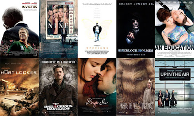
Much like the certificate of the film, the genre also changes the potential audience of the film. I would say that a drama, for the most part, is a character driven story focusing on a series of events; they can be gripping, exciting and even emotional. This then, allows for a wide range of audiences to be interested in the film, thus creating a much larger audience range. If you think about, there is probably a sense of 'drama' in most films ever made - you can see from film websites such as IMDB and Rotten Tomatoes, a film may be classed as a thriller, kids movie or even mystery/suspense, but they all may be labelled 'drama' too. This is why the drama genre bodes well for the short film; many may not be interested in horror movies, sci-fi or romcoms, but drama has the potential to incorporate elements of many genres into one eventful film.
 |
| A short list of films, illustrating how varied a 'drama' can be; there are kids dramas, sci-fi dramas, fantasy dramas, mystery dramas, etc, etc. |
We would expect our short film to be watched mainly on YouTube. Other places it will available to watch are on Facebook and our blog. Each website allows for a different type of audience; Facebook and YouTube are more likely to attract the average viewer - considering the sheer number of uploads on YouTube, it's highly unlikely that friends and family will find our short film without guidance, so we will be pointing friends/family toward our film upon its completion.
 |
| YouTube - home to thousands of short films. |
Monday, 5 December 2011
Reborn, Production Logo
Adie had the idea to use flames in conjunction with the word 'Reborn' for our company logo, as though to portray the phrase 'rise from the ashes'.
There's a large quantity of free stock footage across YouTube of flames, although some aren't quite what we were looking for. We may probably even film our own flames, that way we can get the exact look we're hoping for.
I went ahead an experimented with stock footage I found from youtube -
With this original footage at hand, I wanted to speed up part of the sequence so that slow motion wasn't used through the entirety of the clip.
We also had in mind the idea of adjusting the flame in a way that it looked hand drawn; an effect we'd seen in a previous A2 students logo. With regards to the title 'Reborn', we simply wanted it to appear alongside, or behind the flames.
(The below video is just a first draft of the production logo, incorporating a handful of our ideas)
Final production logo; added bloom effect to the black underlaying writing.
Title Sequences
The title sequence of a film can be very important; it can even in some cases give us a subtle insight to the nature or themes of the film. So how exactly do filmmakers avoid boring the audience with cast and crew names fading around the screen?
A particular website, 'Art of the Title' dedicates itself to "the artists who design excellent title sequences".
Some examples include 300, Lemony Snicket's A Series of Unfortunate Events and Casino Royale.
Keeping in mind James Bond films, the franchise has almost always used their title sequences in a way that depicts the topic of the film, 'Goldfinger' for instance shows women painted in gold as well as scenes from the film with a gold overlaying colour. A couple of the earlier Bond films also chose to reminisce on previous of the series' entries, as though to recap other of Bond's adventures. Whereas some simply chose to show silhouette's of women; an iconic image associated with Bond.
The artists behind these title sequences make them bearable with stylish imagery and dazzling colours. Perhaps most importantly is the theme song for the film; with the title sequences acting almost as an unveiling to the new Bond theme.
Many other title sequences from various films follow these traditions and incorporate their artistic style into the titles, affecting the fonts, music and imagery. A prime example being 'Juno'.
Juno's title sequence went through a lot of work, including 900 still images of Ellen Page walking on a treadmill and drinking SunnyD. These images were then run through a Photocopier to degrade their quality and achieve the hand drawn look that the final sequence offers. Finally, they were physically cut out and scanned back into a computer on top of digitally drawn backgrounds to achieve this colourful, quirky stop-motion title sequence. Shadowplay, the studio behind the title sequence have had the pleasure of working on other Jason Reitman films including 'Thank you for Smoking' and 'Up in The Air'. The studio are good at what they do because they don't just write the names of the cast and crew across their titles, they treat the sequence as a separate project of its own, and therefore provide the audience with often colourful, unique approaches to title sequences.
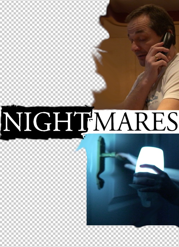
Of course, with a time restriction of 5 minutes, we cannot afford to have a long title sequence, and so will effectively 'cram' our titles during the introduction of the film, after Ivy has woke up for the first time from her nightmare. Like most short films, we won't put too much emphasis on the title sequence except for the title itself.
 |
| On Her Majesty's Secret Service's Title Sequence |
 |
| The Man With The Goldren Gun's Title Sequence |
 |
| Goldfinger's Title Sequence |
Some examples include 300, Lemony Snicket's A Series of Unfortunate Events and Casino Royale.
Keeping in mind James Bond films, the franchise has almost always used their title sequences in a way that depicts the topic of the film, 'Goldfinger' for instance shows women painted in gold as well as scenes from the film with a gold overlaying colour. A couple of the earlier Bond films also chose to reminisce on previous of the series' entries, as though to recap other of Bond's adventures. Whereas some simply chose to show silhouette's of women; an iconic image associated with Bond.
The artists behind these title sequences make them bearable with stylish imagery and dazzling colours. Perhaps most importantly is the theme song for the film; with the title sequences acting almost as an unveiling to the new Bond theme.
Many other title sequences from various films follow these traditions and incorporate their artistic style into the titles, affecting the fonts, music and imagery. A prime example being 'Juno'.
 |
| Just a handful of 900 still images composed to make Juno's title sequence. |
Juno's title sequence went through a lot of work, including 900 still images of Ellen Page walking on a treadmill and drinking SunnyD. These images were then run through a Photocopier to degrade their quality and achieve the hand drawn look that the final sequence offers. Finally, they were physically cut out and scanned back into a computer on top of digitally drawn backgrounds to achieve this colourful, quirky stop-motion title sequence. Shadowplay, the studio behind the title sequence have had the pleasure of working on other Jason Reitman films including 'Thank you for Smoking' and 'Up in The Air'. The studio are good at what they do because they don't just write the names of the cast and crew across their titles, they treat the sequence as a separate project of its own, and therefore provide the audience with often colourful, unique approaches to title sequences.
Of course, with a time restriction of 5 minutes, we cannot afford to have a long title sequence, and so will effectively 'cram' our titles during the introduction of the film, after Ivy has woke up for the first time from her nightmare. Like most short films, we won't put too much emphasis on the title sequence except for the title itself.
Title Sequence Analysis

I have chosen to analyse 'The Sixth Sense' because of the similarities it shares with our short film (plot and character commonalities rather than title sequence).
The lead character in both 'The Sixth Sense' and our short film are children, suffering with issues revolving around the dead; Ivy, our lead character, is tormented by someone, something, in her nightmares. The nightmares are recurring and affect her day to day life. Cole, the lead character of 'The Sixth Sense' is able to see and speak with the dead leaving him troubled and isolated. - both film has a similar structure, in the sense that the endings have revealing twists which help us further understand the plot.
 There is in fact very little to say about TSS's (The Sixth Sense) title sequence; it doesn't use any of the discussed methods to keep the audiences interest, consisting of only bland text and James Newton Howard's accompanying orchestral score.
In fact, the only factor of the title sequence that portrays the subject of the film is the score itself. Its violins reach crescendos when the films title appears through the sequence, and the composition is constantly haunting and slow.
Each frame of text utilizes both tracking and size to try and make for a more interesting title sequence, but the affect quickly wears thin. Below is my own attempt to recreate this 'growing text' effect.

 |
| I key-framed both size and tracking to create the 'expanding' effect, I also changed the font colour to that of The Sixth Sense's. |
The only interesting aspect of the title sequence is the reveal of the title itself, which as said, builds to a crescendo, but also appears to be coated in moving shadows referring to theme of the film.

Although these are the style of titles we wish to use (simply because we don't have the time or skill to do otherwise), we will use them alongside the film, rather than seperately. This way the audience don't feel they're watching 2 minutes of text!
Subscribe to:
Posts (Atom)