The costumes we will be needing for the actors are fairly simple and do not require us to go out of our way majorly to find them.
Ivy, (Megan) overall will need need two costumes. One for the night scenes and one for the day scenes, these will be a pair of pyjamas and a school uniform.
Below are examples of these:
Beth (Katie) will only need one costume to signify the clothes that she died in.
Below is an example of this:
Ivy's dad (Nick) will need two costumes, the breakfast scene and the night scene for this he will need one set of clothes that are smart and imply that he is going to work and the other will just need night clothes, predominantly a dressing gown.
Our film idea is rather strange when it comes to selecting a genre. This is down to the fact that at first it seems like a completely different style to what it turns out to be in the end. At the beginning it gives off the impression that it will very much be a horror/thriller but at the end it changes quite dramatically when you find the conclusion of the film which in itself seems very much more along the lines of drama. From last year we both knew from experience that there were certain types of genre that we wanted to stay clear of for example pure horror as we felt that when it comes to student films they can have a lack of story (or a unclear plot) character development and are not always pulled off to the best of people abilities which is why we tried to focus our ideas mainly on the genre of 'drama'. We felt that making sure our film was understandable yet interesting and nice to watch was one of the main things we needed to focus on and when it comes to genre you really need to get a clear view on what you are portraying.
A little bit of information about genre itself:
Genre is defined by the elements within a film and there are certain elements for certain categories and this is what gives us genre. There are so many different sections and sub-sections of genre nowadays that it very hard to classify a film within one genre completely. Films have so many underlying elements that the genre of a film needs to be shown in a way that critics, viewers and media theorists need to be aware of. Genre is normally recognised by some form of descriptive or functional approach that you may take note of within the film, perhaps by looking at one of the following; location, character archetypes, plot content, costume, or shot transitions. The functional approach is more inclusive of asking questions about the film and seeing how the answer turns out, this could e an obvious giveaway to the genre.
Characters- Drama
Locations- Drama
Themes- Soft horror
Costumes- Drama
etc..
Most of the elements within our film suggest a slight genre hybrid of drama/ horror. Perhaps not even to the extent of horror as the only horrific element is that of the ghost of her sister. Though some of the connotations of our film such as death, nightmares and even having the main character as a girl may lead to believe it is a horror, we see it more as a drama with dark themes and especially do not see it as a horror that involves gore or violence. We have tried to create an illusion of suspense to enthral the audience with these themes not just throw it in their faces with shock tactics.
Continuity is possibly one of the most important things within a film that needs to be pulled off with the highest standards possible. If the continuity isn't right then the whole film will look and feel completely unexplained and well delivered as well as disjointed. Continuity can refer to the plot of the film to make sure things make sense and it can also refer to how the film is made. In terms of the plot, it means the film just making sense to the viewer, discontinuity can be observed when someone notices a plot hole and there are some pretty famous plot holes out there.
Some are quite funny when it comes to the writing of the plot, for example, in 'Transformers' (2007) We are told that the glasses the 'Decepticons' so desperatly need are the very glasses that young Sam Witwicky has placed on Ebay for sale. Yet later in the the film we are also told that the 'Decepticons' can very easily hack into the United States military network, which leads to the question, wouldn't placing a simple Ebay bid be an easier option?
Another example can be seen in 'Back to the Future' (1985) Marty Mcfly goes back and alters his family past changing the future for the better, and meets his parents at the same time. Yet neither of his parents seem to remember the kid who brought them together and inspired his father to write sci-fi, has the same name as the famous 'Calvin Klein' and who happens to look exactly like their own son?
Of course the producers could be leaving it up to the audience to just look over it and enjoy the film but plot holes can sometimes ruin a film if they are just too unbelievable.
When it comes to the production it can become a lot more complex in terms of making sure everything runs smoothly. These concern things such as editing and most noticeable visual errors which can occur with props, costumes, makeup or anything that is changed day to day with set or scene such as weather. The problem with large scale films is that they are never normally shot in order which means that if something goes wrong with continuity the best way to deal with it is to edit it out or edit it cleverly but sometimes it just cannot be avoided. Smaller things such as change in the length of cigarettes or the amount of water in a glass can completely ruin the illusion of reality for the viewer if they are extremely noticeable. Editing can be a problem when certain rules are not followed for example the 180 degree rule. If this rule is not followed and the characters that are involved in dialogue or screen time, are not looking towards each other when they should be, by keeping each character looking in the direction of the other and are kept to either side of the screen, the viewer may become confused or not fully understand the scene which can completely ruin a film. Below is a short video from the New York Film Academy explaining continuity and the 180 degree rule.
This is a rough presentation of our soon to be made short film, 'Nightmares'.
The finished film's shots will be much longer, creating tension in the appropriate scenes with much more fluent editing. Eleanor Lewis portrays Ivy in the photographs, Megan Squires portrays her sister and I portray Ivy's father. These casting decisions are simply placeholders until we can come to an agreement on the actors for the film. Location is also likely to change, prop layout, plot structure and cinematography will remain largely the same.
After researching into a number of title sequences from popular films it is clear that their success can swing either way. On one hand, a title sequence can pass by the audience completely unnoticed. On the other, it can leave a brilliant lasting impression. The title sequences that tend to leave an impression, however, are those with impressive effects and imagery. In these circumstances then it would be beneficial to aim for a less striking title sequence, including a simple title card perhaps with a 'fancy' fade-in of some sort, and then progress to the cast and crew's names displayed over the introduction of the film.
I'm going to take inspiration from my previous film that I made for AS Media. The title cards that slot between each scene of the film were plain black with a white serif font.
I aim to take even less focus off the title cards by simply placing them over the video rather than cutting the video to make room for the title cards. This way the audience can enjoy the film whilst we display the necessary credits. I do however want to put emphasis on the title of the film, and perhaps have that over a black background, with enlarging text.
The 'Tracking' option for text in Final Cut seems to widen the gap between each letter in a word. Finding the right balance of tracking seems to give the text a great 'cinematic' feel to it. I could perhaps also use key-framing to go from less-to-more tracking of the title.
For the cast and crew, I can place the titles over alternating sides of the screen, for example:
Directed by Benjamin Squires (bottom left), Story by Adie Grimbley (bottom right). This gives the title sequence a small amount of movement, stopping it from being a complete bore!
When we got the chance, we experimented with lighting and colour to see what effects we could achieve;
We thought a particularly good use of lighting was the silhouette achieved when the light was behind the actor; although we're not sure when we'd be able to use this effect.
Although colour adds a nice touch to the shot, we'll only be using it subtly compared to how we used it in the video.
After we liked the silhouette effect we accidentally stumbled across last practise, I went out and purposefully experimented with silhouettes and lighting. The final shots are actually quite nice!
When it came to doing our storyboards, I tried to leave it vague but to allow some room for change within the overall look of the film. This was mainly because when it comes to filming, you never know what could change on the day or whether you can even manage to get some shots due to the location. This happened to me last year and I felt that having a vague yet instructive storyboard would be the best way to go about it. Along with the images I added notes about sound,lighting and even some of the connotations that would go along with the scenes. I felt this was important to give us some guidance, as well perhaps giving us some more ideas when it came to the actual days of filming. Below are the large images of the storyboard I created, and beneath them is a small slideshow of the closeups.
Shooting on film looks great, but it's expensive and not an option for student film. Luckily, there are countless numbers of tutorials and explanations on youtube regarding how to achieve the film look.
But why is that film look so desirable?
There are a number of differences between film and digital with arguably, the biggest contributing factor being colour. Many YouTube film-makers try to achieve the film look with colour correction through software such as Adobe After Effects or 'Color'. The colour in film seems to be much more contrasting, vibrant and deep. Another factor that contributes to the film look is FPS (frames per second). Films are shot at 24 fps, and although the average moviegoer won't be able to tell the difference between 24fps and 30fps, there is a difference.
Control of the camera also has a major affect. If the camera is shaking everywhere, not focused properly and controlled in an amatuer fashion, it won't look like it's been shot by a filmmaker, just a student with a camera; filmmakers should use tripods, dollys and steadicams to a achieve a much better image.
Perhaps another very obvious giveaway in regards to film vs. digital is the aspect ratio. When you see a film on TV, you'll notice the aspect ration becomes letter-boxed (most of the time). This is because televisions are made accustomed to the 16:9 aspect ratio whereas film is usually shot in either 2.35:1 or 1.85:1. The camera that we and the majority of other student film makers use shoots in 16:9 which is why during the editing stage, many choose to add the 'letterbox' effect to achieve that film look.
The video below shows a great comparison of digital and video including the main differences between each. The point of the video is to see how closely the film look can be replicated on digital. The end effect is quite impressive.
Achieving the film look may not be not necessary, but as Tarantino was saying, it all helps to create the illusion of what a movie really is.
Taking these things into account I tried to make a short video of my dog playing, look more filmic;
A screen shot from raw, unedited video.
As you can see form the still, the colours are a little dull and could do with some correction.
Using the technology that I have available (Final Cut), I only went through a couple of stages to get to the finished result.
1. 'Widescreen'
The cheap effect of altering the aspect ratio of my video from 16:9 to 2:35:1 by simply adding the 'letterbox' effect. 2. 3-way Colour Correction
The most important step of the two. As you can see from the visual colour correction diagrams below, there are a number of things I changed. First, the saturation, which refers to how 'bright' the colour is. No saturation will make the video black and white, whereas full saturation will show an unnatural, vibrant picture. I bumped up the saturation slightly to enhance the colours, but not ruin them.
I then made both the blacks and the mids slightly darker to create more depth, and made them both ever so slightly blue, whilst moving the whites more toward orange.
Original
Colour Corrected
The process was purely experimental, seeing what suited the video best, and colour correcting accordingly. I assume each location will require different colour correction and alterations, but practising these skills before the editing stage will surely help me in the long run.
Here is the end result -
The image looks deeper and colours are more vibrant because of colour correction.


 Genre is defined by the elements within a film and there are certain elements for certain categories and this is what gives us genre. There are so many different sections and sub-sections of genre nowadays that it very hard to classify a film within one genre completely. Films have so many underlying elements that the genre of a film needs to be shown in a way that critics, viewers and media theorists need to be aware of. Genre is normally recognised by some form of descriptive or functional approach that you may take note of within the film, perhaps by looking at one of the following; location, character archetypes, plot content, costume, or shot transitions. The functional approach is more inclusive of asking questions about the film and seeing how the answer turns out, this could e an obvious giveaway to the genre.


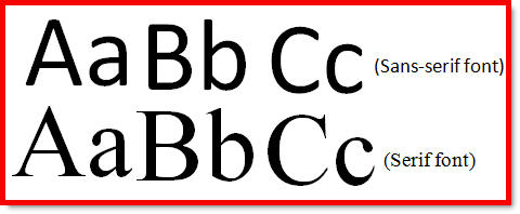 I aim to take even less focus off the title cards by simply placing them over the video rather than cutting the video to make room for the title cards. This way the audience can enjoy the film whilst we display the necessary credits. I do however want to put emphasis on the title of the film, and perhaps have that over a black background, with enlarging text.
 The 'Tracking' option for text in Final Cut seems to widen the gap between each letter in a word. Finding the right balance of tracking seems to give the text a great 'cinematic' feel to it. I could perhaps also use key-framing to go from less-to-more tracking of the title.


